At Kansai Paint, we know that the colours we surround ourselves with have a huge influence on our happiness and wellbeing. Choosing colour is a big decision because of this, and not one that’s always easy to make. As one of the world’s top paint manufacturers, we’re known for setting new standards in our performance and innovation. The unique strength of our brand can be attributed to our unwavering commitment to quality and inspiration, and our 2016 Colour Forecast has been created in this spirit. In it, we continue to celebrate the power that colour has to positively impact our mood, lives and homes. By sharing global trends in this way, we want to make working with colour inspiring, exciting and, most of all, accessible. Once again this year, we partner with Global Color Research, the colour experts behind MIX magazine, a global thought leader on colour and design trends. Pooling our combined wealth of experience we aim to deliver colour inspiration to the global market in creative and engaging ways.
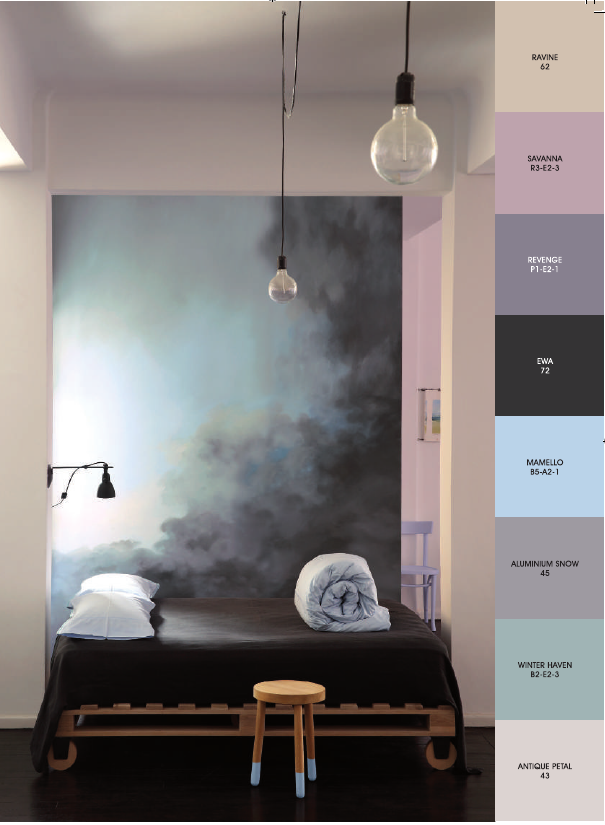
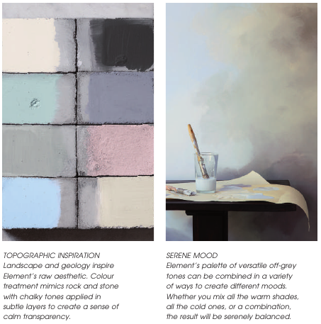
ELEMENT
Element is about our relationship with an ever-changing landscape and the raw beauty of our world. It explores the contrast between the power of this place to sustain life, and the fragility of the balance that results.
Inspired by this dynamic, a palette of soft neutrals, raw surfaces and tonal colour is drawn directlly from the earth’s layers to create a sense of depth and contrast. This is heightened by graddated effects and distressed finishes, giving a luxurious feeling to this textural theme.
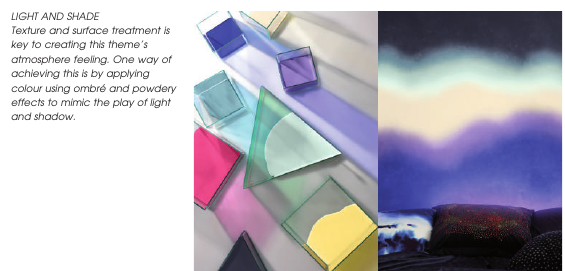
DISCOVERY
Discovery appeals to our collective fascination for the unknown, looking to the outer reaches of the universe for inspiration. With a palette of cool colours and bright accents against a dark night-sky inspired backdrop, this theme is both energetic and pensive.
In Discovery, colour is often applied in ombré finishes to add an atmospheric quality and sense of weightlessness. Alternatively, it can also be expressed in bands and stripes that suggest energy and advancement with a futuristic spirit.
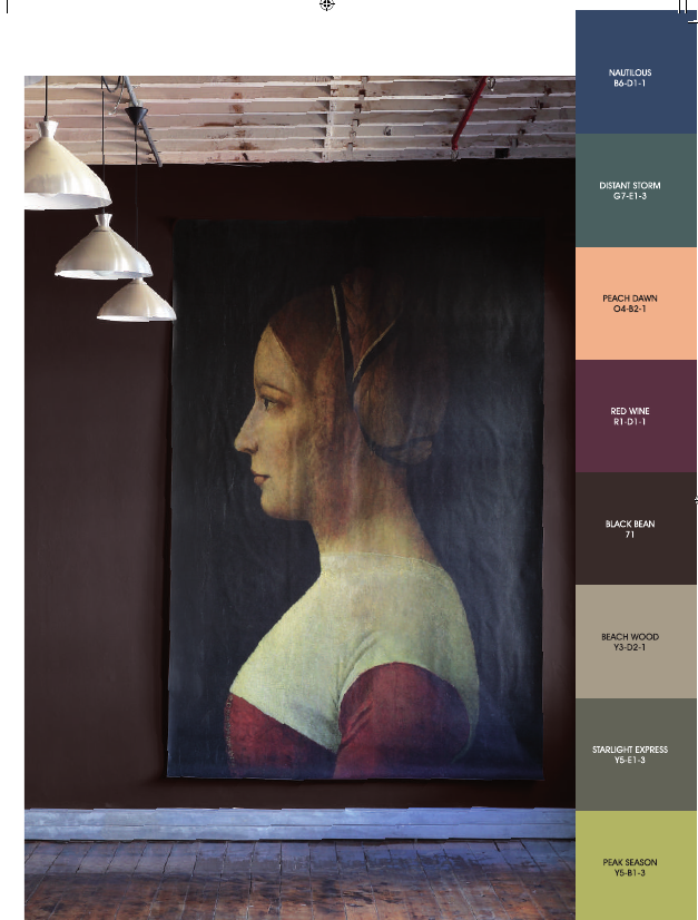
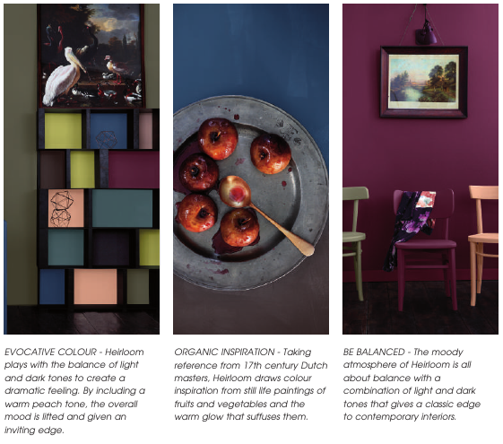
HEIRLOOM
Heirloom is inspired by a heady blend of historical influences to give a sense of heritage and indulgent luxury. The combination of rich colour and texture looks to classicism for its reference points but updates them with a new interpretation for a contemporary audience.
In this theme, the dark sensuous palette is given extra depth with aged surface effects and treatments. Design details take their cues from traditional forms but the colour, scale and materials are re-imagined with a fresh point of view.
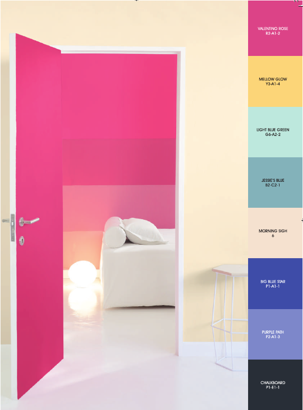
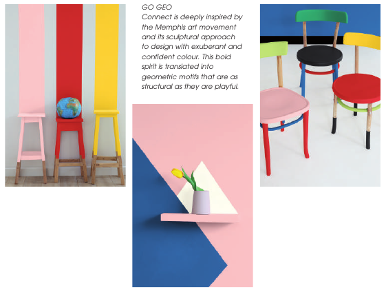
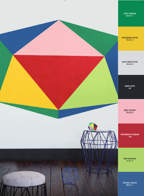
CONNECT
As a reaction against the cold minimalism that dominates modern design, Connect is upbeat, bold and endlessly confident. With a low-tech approach, it champions the handcrafted and human and is inspired by abstract collage, bold graphics and geometric forms.
With a back-to-basics palete defined by pure and vivid colour, Connect encourages experimentation and playfulness. Colour is treated as a building block to create lively patents and surfaces and an overriding spirit of optimism is the starting point for truly living spaces.